
How to Select Shutter Colours for a Stunning Home Finish

How to select shutter colours
Finding the right shutter colour for unique windows can feel daunting when every room in your West Yorkshire home responds differently to light and décor. The way natural and artificial lighting interacts with surfaces and colours will significantly shape your choices, often altering how paint or stains appear throughout the day. This guide delivers practical, expert-backed advice on picking the ideal shutter colour, helping you balance architectural character, lighting, and your personal style for a truly harmonious finish.
Table of Contents
- Step 1: Assess Your Room’s Lighting And Décor
- Step 2: Explore Popular Colour Options And Finishes
- Step 3: Match Shutter Colours To Your Window Shapes
- Step 4: Compare Sample Swatches In Situ
- Step 5: Confirm Your Final Colour Choice With Expert Advice
Quick Summary
| Key Insight | Explanation |
|---|---|
| 1. Assess your room’s lighting | Evaluate natural and artificial light to guide colour choices for shutters. |
| 2. Choose popular colour options | Explore traditional and contemporary colour palettes that complement your style. |
| 3. Match colours to window shapes | Select shutter colours that complement your windows’ architecture. |
| 4. Compare swatch samples at home | Test colour samples in different lighting conditions for accuracy before the decision. |
| 5. Seek professional advice | Consult design experts for refined insights on colour choices and undertones. |
Step 1: Assess your room’s lighting and décor
Selecting the perfect shutter colour begins with a careful, systematic evaluation of your room’s existing lighting and overall interior design palette. This critical first step ensures your shutters will harmonise beautifully with your space, creating a cohesive and stunning visual finish.
Start by understanding how natural and artificial lighting interact within your room. Interior lighting design principles reveal that different light temperatures can dramatically alter colour perception. Take time to observe your room at various times of day, noting how sunlight changes the appearance of walls, furniture, and potential shutter tones.
Key factors to consider during your assessment include:
- The room’s primary light sources (windows, skylights, artificial lighting)
- Existing colour schemes and décor styles
- Wall colours and their undertones
- Furniture finishes and textile colours
- The room’s overall mood and ambience
Carefully document these observations, taking photographs where possible to help you systematically compare and contrast potential shutter colours. Remember that natural light exposure plays a crucial role in colour selection, with north-facing rooms requiring different colour strategies compared to sun-drenched southern spaces.
This table highlights how natural light direction can influence shutter colour perception:
| Room Orientation | Light Quality | Recommended Colour Approach |
|---|---|---|
| North-facing | Cool, muted | Warm or creamy tones |
| South-facing | Bright, warm | Cool neutrals or bold shades |
| East-facing | Soft, morning light | Subtle pastels or soft colours |
| West-facing | Strong evening glow | Earthy or deeper muted colours |
The right shutter colour can transform a room’s atmosphere, balancing light and creating visual harmony.
Expert tip: Use a white sheet of paper or a neutral paint swatch to objectively assess how different lighting conditions affect potential shutter colours throughout the day.
Step 2: Explore popular colour options and finishes
Navigating the world of shutter colours requires understanding the nuanced relationship between traditional palettes and contemporary design trends. Your goal is to select a finish that not only complements your interior but also reflects your personal style and enhances your home’s architectural character.
Traditional paint colour palettes offer a wealth of inspiration, ranging from elegant neutrals to bold statement hues. Consider these popular colour categories for your shutters:
- Neutral tones: Soft whites, warm creams, and sophisticated greys
- Classic colours: Sage green, deep navy, and muted earth tones
- Contemporary finishes: Charcoal, metallic accents, and matte black
- Natural wood stains: Light oak, walnut, and rich mahogany
When exploring finishes, pay attention to the texture and sheen that will best suit your room. Gloss finishes create a sleek, modern look, while matte finishes provide a more subtle, understated elegance. Some homeowners prefer a soft satin finish that strikes a balance between shine and subtlety.

Here is a comparison of popular shutter colour finishes and their visual effects:
| Finish Type | Appearance | Best For |
|---|---|---|
| Gloss | Reflective, bold | Modern or high-contrast rooms |
| Satin | Balanced, soft sheen | Subtle elegance, versatility |
| Matt | Flat, understated | Classic or relaxed interiors |
| Natural Wood Stain | Warm, textured | Traditional or rustic spaces |
The right shutter colour can transform your space, creating visual harmony and reflecting your unique design sensibility.
Expert tip: Always obtain colour samples and test them in your actual room lighting to ensure the perfect match before making a final decision.
Step 3: Match shutter colours to your window shapes
Choosing the perfect shutter colour involves more than aesthetic preference – it requires a thoughtful understanding of your window’s architectural characteristics. Traditional window design principles emphasise the critical relationship between window shapes and shutter aesthetics.
Consider these key factors when matching colours to your window styles:
- Bay windows: Soft neutrals or complementary earth tones
- Sash windows: Classic whites or period-appropriate heritage colours
- Arched windows: Subtle greys or muted tones that enhance architectural lines
- Modern rectangular windows: Bold contemporary colours or sleek monochromatic finishes
- Asymmetrical window shapes: Neutral colours that provide visual balance
The goal is to create a harmonious visual connection between your shutters and window design. Architectural symmetry plays a crucial role in colour selection, ensuring that your shutters appear as an integrated part of the window’s overall composition.
The right colour transforms shutters from mere window coverings into architectural statements that enhance your home’s unique character.
Expert tip: Take photos of your windows under different lighting conditions to accurately assess how potential shutter colours interact with your architectural features.
Step 4: Compare sample swatches in situ
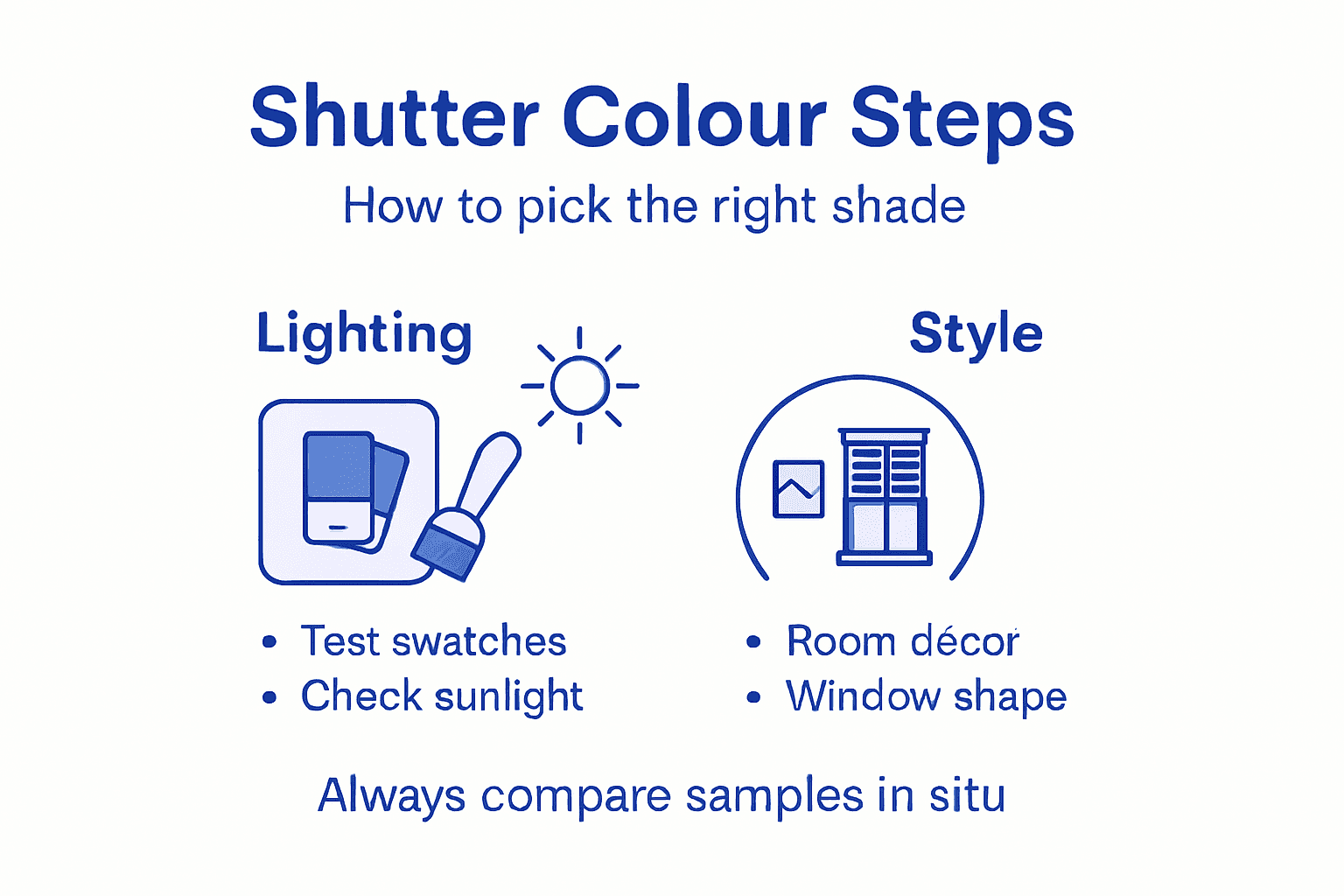
To make an informed shutter colour choice, you’ll need to evaluate sample swatches directly in your home’s unique environment. Design professionals recommend examining physical samples to understand how colours truly interact with your specific lighting and interior elements.
Follow these strategic steps for comprehensive swatch comparison:
- Collect multiple colour samples from your preferred shutter range
- Position swatches against walls, near windows, and beside furniture
- Observe samples at different times of day – morning, afternoon, and evening
- Check how artificial and natural light affect the colour perception
- Photograph swatches in various lighting conditions for objective comparison
Pay close attention to how colour undertones shift throughout the day. A grey that appears warm and soft in morning light might look completely different under evening lamplight. Consider the visual interaction between your swatch and surrounding architectural features to ensure a harmonious, cohesive aesthetic.
Choosing the right shutter colour is about understanding how light, texture, and context work together to create a stunning visual experience.
Expert tip: Attach swatch samples using removable mounting tape to prevent wall damage and allow easy repositioning during your evaluation process.
Step 5: Confirm your final colour choice with expert advice
Bringing professional insight into your shutter colour selection can transform your decision from good to exceptional. Expert design consultations offer nuanced perspectives that go beyond personal intuition, helping you navigate the complexities of colour selection with precision and confidence.
Consider engaging with design professionals through these strategic approaches:
- Request a professional colour consultation from interior design experts
- Book a consultation with a certified colour specialist
- Discuss your room’s specific lighting and architectural characteristics
- Present your sample swatches for professional evaluation
- Seek objective feedback on colour undertones and interactions
Professional guidance provides multiple layers of validation for your colour choice. Interior design experts understand how subtle variations in shade, light reflection, and room context can dramatically impact the final aesthetic. They can help you anticipate potential challenges and ensure your chosen shutter colour will create the desired visual impact.
A professional perspective transforms colour selection from a personal guess to a strategic design decision.
Expert tip: Consider scheduling a virtual consultation to receive professional advice without an in-person visit, saving time and gaining valuable design insights.
Transform Your Home with Expertly Coloured Shutters from Shutter World
Choosing the perfect shutter colour can feel overwhelming, given the many factors that affect how shades appear in your space. This article highlights key challenges like balancing natural light, matching architectural window shapes, and testing swatches in situ to avoid colour surprises. If you want bespoke shutters that truly complement your interior’s lighting and style, Shutter World offers expertly crafted solutions tailored to your unique needs.
Experience the confidence of a fully managed service from measurement to installation with custom shutters designed for even the most complex window shapes. Whether you want classic neutrals or bold contemporary finishes, our premium hardwood and durable MDF ranges ensure stunning, lasting results. Discover how our Ossett team’s expertise can help perfect your space today by exploring our West Yorkshire shutters Archives | Shutter World and planning your ideal finish.
Ready to select shutter colours that enhance your home’s atmosphere while providing superior light control and privacy? Visit our website to browse styles and request a consultation at Shutter World – Bespoke Interior Shutters Designed to Transform Your Home. Explore bespoke options like our Ossett Plantation shutters Archives | Shutter World and let us help you create the perfect balance of style and function.
Frequently Asked Questions
How do I assess my room’s lighting and décor when selecting shutter colours?
Begin by observing how natural and artificial lighting affects your room throughout the day. Take notes on your primary light sources, existing colour schemes, and overall ambience to ensure your chosen shutter colours create visual harmony.
What are some popular shutter colour options to consider?
Popular shutter colour categories include neutral tones such as soft whites and warm creams, classic colours such as sage green or deep navy, and contemporary finishes such as charcoal or matte black. Explore a variety of these options to find a finish that complements both your interior style and your home’s architectural character.
How can window shapes influence my shutter colour choice?
Consider the architectural characteristics of your windows when selecting shutter colours. For example, bay windows may benefit from soft neutrals, while modern rectangular windows can accommodate bold, contemporary colours to enhance their design.
Why is it important to compare sample swatches in my actual room?
Evaluating sample swatches in your home’s lighting allows you to see how colours interact with different elements in your space. Collect multiple samples and observe them at different times of day to make an informed choice before finalising your shutter colour.
How can I confirm my final shutter colour choice with professional advice?
Engage with an interior design expert or colour specialist to gain insights on your selected colour samples. Present your observations and swatches for professional feedback to ensure your chosen colour achieves the desired aesthetic in your space.
What should I document during my assessment process?
It’s helpful to document your observations regarding light sources, colours, and room ambience. Taking photographs can help you compare potential shutter colours later, ensuring a thoughtful, systematic selection process.
Recommended
- Inspiring Shutter Colour Options for Homes in 2025!
- Shutter Trends for Homes in the UK: 2025 Style & Innovation | Shutter World
- Shutter Finishing Options: Best Choices for UK Homes 2025 | Shutter World
- Shutter Colour Matching Tips for a Perfect Home Look | Shutter World
- Why Some Home Cleaners Leave Streaks (And How to Fix It)