
Shutter Colour Options for Homes in 2025

Shutter Colour Options
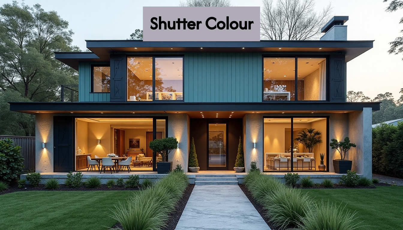
Shutter colours are taking centre stage in 2025, with homeowners moving far beyond plain white. Bolder choices like navy blue, sage green and charcoal black are transforming shutters into striking features. Yet the biggest surprise is just how quickly tastes have shifted. Sage green has surged in popularity, becoming the standout choice for nature-inspired interiors this year. Most wouldn’t expect a subtle green to outshine classics like grey or white, but it’s dominating new trends. That’s not just a style statement—it is reshaping how people think about window design.
Table of Contents
- Trending Shutter Colour Options For Modern Homes
- Choosing The Right Colour For Your House Style
- Coordinating Shutter Colours With Interior Décor
- Expert Tips For Mixing And Matching Shutter Colours
Quick Summary
| Takeaway | Explanation |
|---|---|
| Bold Colour Statements | Deep, saturated hues like navy blue, forest green, and charcoal black are now trending, transforming shutters into powerful visual anchors that reflect personal style and enhance home aesthetics. |
| Nature-Inspired Colour Palettes | Organic shades such as sage green, burgundy, and claret red connect interior spaces with nature, bringing warmth and tranquility and thus increasingly appealing to homeowners. |
| Architectural Harmony | Selecting shutter colours that complement specific architectural styles—such as traditional hues for Victorian homes and bold tones for modern designs—is crucial for maintaining design integrity. |
| Practical Colour Matching Strategies | Collecting fabric swatches and testing colours in various lighting conditions helps ensure colour harmony between shutters and interior décor, making informed decisions essential. |
| Personalisation and Colour Psychology | Embracing personal preferences and understanding the emotional impacts of colours can enhance the design narrative, allowing shutters to become extensions of individual style. |

Trending Shutter Colour Options for Modern Homes
Shutter Colour Options have undergone a dramatic transformation in 2025, moving beyond traditional white and neutral palettes to embrace bold, expressive design statements. Homeowners are now viewing shutters not merely as functional window coverings but as integral design elements that reflect personal style and enhance interior aesthetics.
Bold Colour Statements
The contemporary interior design landscape now celebrates shutters as powerful visual anchors. According to Scottish Shutters Design Trends, deep, saturated hues are dominating modern home design. Navy blue, forest green, and charcoal black have emerged as frontrunners in shutter colour options, offering dramatic contrast and sophisticated depth to living spaces.
These rich colours provide more than aesthetic appeal. They create visual drama while maintaining the clean lines characteristic of modern interior design. Homeowners are increasingly selecting shutters that make a confident design statement, transforming windows from passive elements into focal points of architectural interest.
Nature-Inspired Colour Palettes
Nature continues to inspire colour choices in 2025, with homeowners gravitating towards organic, nuanced shades that bring warmth and tranquility. Village Blinds Colour Trends highlights emerging trends like sage green, burgundy, and claret red as popular shutter colour options. These colours reflect a growing desire to connect interior spaces with natural environments.
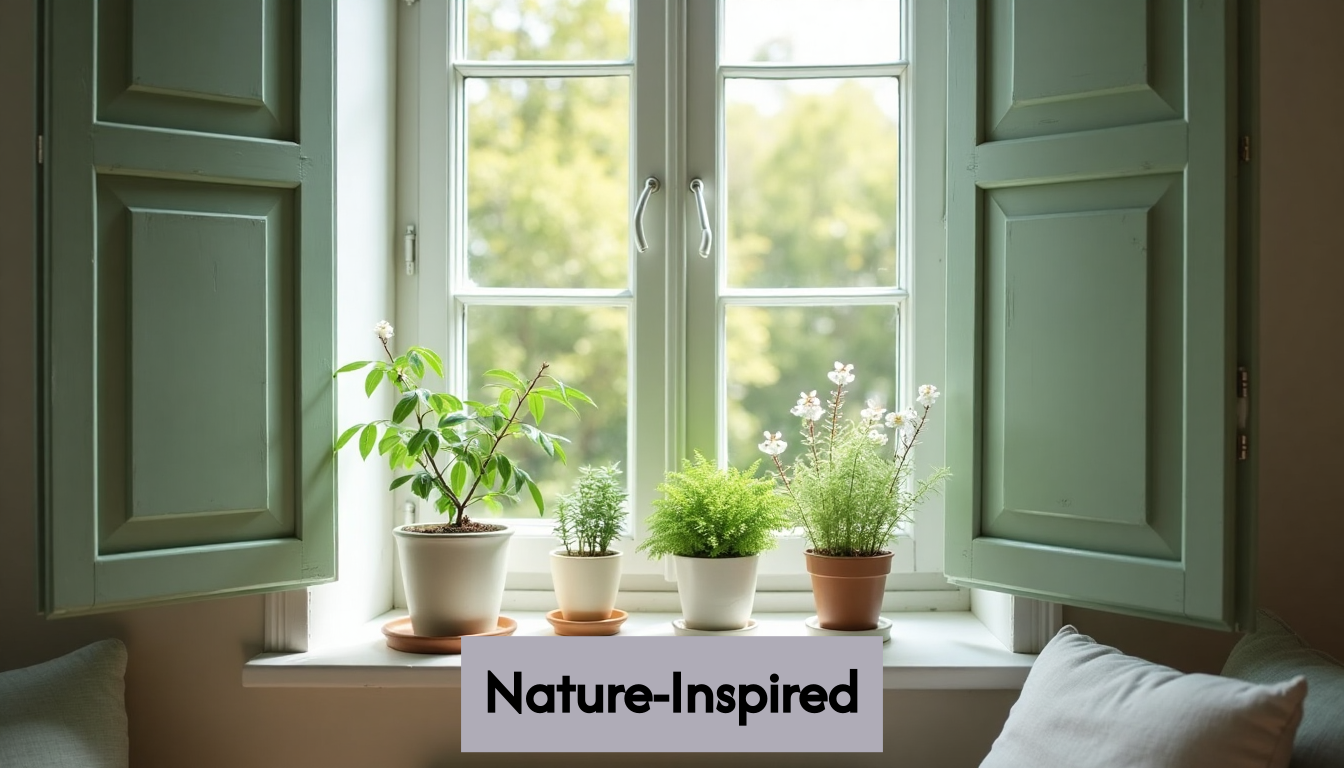
Sage green, in particular, has gained significant traction. Its muted, sophisticated tone bridges contemporary design with biophilic principles, creating spaces that feel both modern and grounded. Burgundy and claret red offer deeper, more luxurious alternatives for those seeking dramatic yet elegant window treatments.
Psychological Impact of Colour Selection
Choosing shutter colours is no longer just about aesthetic preference but also about creating specific emotional responses within living spaces. Deep blues evoke calmness and stability, while rich greens promote a sense of renewal and connection to nature. Charcoal black introduces sophistication and can make other design elements pop with remarkable intensity.
For those interested in exploring more comprehensive window treatment options, our guide on window shutter types provides detailed insights into how colour and design intersect in modern home styling.
The evolving landscape of shutter colour options reflects broader shifts in interior design philosophy. No longer confined to minimalist whites or beiges, shutters now serve as dynamic design elements that express individual personality, complement architectural styles, and transform how we perceive and interact with our living spaces.
Choosing the Right Colour for Your House Style
Selecting the perfect shutter colour for your home requires a nuanced understanding of architectural styles, design principles, and personal aesthetic preferences. Each house style presents unique opportunities and challenges when it comes to choosing window treatments that enhance rather than detract from the overall architectural character.
Architectural Harmony and Colour Selection
According to No Space Like Home Design Trends, natural and earthy tones have emerged as versatile colour choices that complement various architectural aesthetics. The key is to create a harmonious relationship between the shutter colour and the home’s existing design language.
For classic Victorian and Georgian homes, traditional colour palettes work best. Deep forest greens, rich burgundies, and sophisticated navy blues can add depth and elegance to period properties. These colours respect the architectural heritage while introducing a contemporary twist. Modern minimalist homes, by contrast, benefit from bold colour statements that create striking visual contrast.
Colour Psychology and Home Style
Simple Homely Design Insights reveals that different house styles can be dramatically transformed by strategic colour choices. Contemporary homes with clean lines and neutral exteriors can be enlivened by shutters in deep charcoal black or emerald green. These colours introduce drama and sophistication without overwhelming the architectural simplicity.
Cottage and rustic-style homes often work beautifully with softer, more muted tones. Sage green, lavender, and olive green create a seamless connection with natural surroundings. These colours evoke a sense of tranquility and organic harmony, making them perfect for homes that emphasize a connection with the landscape.
Practical Considerations in Colour Selection
Beyond aesthetic considerations, homeowners must also consider practical aspects of colour selection. Village Blinds Colour Guide emphasizes the importance of understanding how different colours interact with natural light and the home’s existing colour scheme.
For homes with significant sun exposure, lighter colours can help reflect heat and maintain cooler interior temperatures. Darker colours, while visually striking, might absorb more heat and potentially increase indoor temperature. This consideration is particularly crucial for homes in regions with intense sunlight.
For those seeking comprehensive guidance on window treatments, our modern interior window treatments guide offers in-depth insights into matching shutters with different architectural styles.
Ultimately, choosing the right shutter colour is a personal journey that balances architectural integrity, individual taste, and practical functionality. By carefully considering these factors, homeowners can transform their window treatments from mere functional elements into powerful design statements that reflect their unique style and enhance their living spaces.
Coordinating Shutter Colours with Interior Décor
Coordinating shutter colours with interior décor has evolved from a mere afterthought to a strategic design approach in 2025. Modern homeowners understand that shutters are no longer just functional window coverings but integral design elements that can dramatically transform living spaces.
Colour Harmony and Design Principles
The Shutter Studio’s London Design Trends highlights the significance of colour coordination in contemporary interior design. The emerging trend focuses on creating visual synergy between shutters and existing décor elements. Soft taupe, dusty pink, and sage green have emerged as versatile colours that seamlessly integrate with various interior design schemes.
Designers recommend adopting a colour wheel approach when selecting shutter colours. Complementary colours create visual tension, while analogous colours provide a more harmonious and cohesive look. For instance, deep navy shutters can beautifully complement neutral grey interiors, adding depth and sophistication to minimalist spaces.
Statement Colours and Accent Design
Scottish Shutters Design Trends reveals that vibrant, statement-making shutter colours are transforming interior design strategies. Rich jewel tones like emerald green, deep blue, and burgundy are being used to create focal points that coordinate with feature walls or accent furniture.
This approach allows homeowners to use shutters as a design tool rather than a passive background element. A charcoal black shutter can anchor a room with light, neutral walls, creating a dramatic visual contrast. Similarly, forest green shutters can echo botanical-themed décor, reinforcing the room’s design narrative.
Practical Colour Matching Strategies
Simple Homely Design Insights emphasizes the importance of considering both aesthetic and practical aspects when coordinating shutter colours. Homeowners are advised to collect fabric swatches, paint samples, and décor elements to create a comprehensive colour palette.
For those seeking personalized guidance, our bespoke interior shutter consultation can help you navigate the nuanced world of colour coordination. Professional designers recommend creating mood boards that include potential shutter colours alongside existing furniture, wall colours, and decorative elements.
Consider the room’s lighting conditions when selecting colours. Natural light can significantly alter how a colour appears, so it is crucial to test colour samples at different times of the day. A colour that looks perfect in morning light might appear entirely different in the evening.
Ultimately, coordinating shutter colours with interior décor is an art form that requires creativity, understanding of design principles, and a keen eye for detail. By thoughtfully selecting colours that complement and enhance existing design elements, homeowners can create spaces that feel intentional, harmonious, and uniquely personal.
Expert Tips for Mixing and Matching Shutter Colours
Mixing and matching shutter colours has become an art form in 2025, with interior design professionals offering sophisticated strategies for creating visually compelling and harmonious living spaces. Gone are the days of uniform, predictable window treatments—today’s approach celebrates creativity, personal expression, and nuanced colour coordination.
Strategic Colour Pairing Techniques
Scottish Shutters Design Trends reveals that bold shutter colours work best when strategically paired with feature walls or accent décor. Designers recommend using the colour wheel as a fundamental tool for creating cohesive colour relationships. Complementary colours—those directly opposite on the colour wheel—create dynamic visual tension, while analogous colours provide a more subtle, harmonious effect.
For instance, deep forest green shutters can be beautifully balanced with soft terracotta or warm beige walls. The key is to maintain a sense of balance, ensuring that the shutter colour enhances rather than overwhelms the room’s overall aesthetic. Professional designers suggest using the 60-30-10 rule: 60% dominant colour, 30% secondary colour, and 10% accent colour.
Texture and Finish Considerations
Woody’s Shutters Expert Guide emphasizes the importance of considering texture and finish when mixing shutter colours. Matte finishes in soft greys or natural wood tones offer a timeless look that suits both modern and traditional interiors. These neutral bases provide flexibility for more adventurous accent colours in room furnishings.
For homes with multiple rooms or open-plan spaces, creating a cohesive colour narrative becomes crucial. This doesn’t mean using identical colours throughout, but rather establishing a subtle colour dialogue. For example, using variations of the same colour family across different rooms can create a sense of visual continuity while allowing each space to maintain its unique character.
Personalisation and Colour Psychology
Personalisation is at the heart of 2025’s shutter colour trends. Our comprehensive shutter selection guide suggests that homeowners should view shutter colours as an extension of their personal style. This means moving beyond conventional wisdom and embracing colours that truly resonate with individual preferences and emotional responses.
Colour psychology plays a significant role in this approach. Deep blues can create a sense of calm and stability, while emerald green might invoke feelings of renewal and vitality. Charcoal black shutters can add sophistication and drama to a space, serving as a powerful design statement.
Practical considerations remain important. Natural light can dramatically alter how a colour appears throughout the day, so experts recommend testing colour samples at different times. Collecting fabric swatches, paint samples, and creating comprehensive mood boards can help visualize the final effect.
Ultimately, mixing and matching shutter colours is about creating a personal narrative within your living space. It requires a delicate balance of design principles, personal intuition, and a willingness to experiment. By approaching colour selection as an art form, homeowners can transform their windows from mere functional elements into powerful expressions of individual style and creativity.
Frequently Asked Questions
What are the trending shutter colours for homes in 2025?
In 2025, popular shutter colours include bold hues like navy blue, forest green, and charcoal black, alongside nature-inspired shades like sage green and burgundy, which are becoming increasingly popular.
How can I choose the right shutter colour for my home style?
To choose the right shutter colour, consider your home’s architectural style, the emotional response you want to evoke, and how different colours interact with natural light. Classic homes often look best with traditional colours, while modern homes can embrace bolder choices.
What is the psychological impact of shutter colour selection?
Shutter colours can evoke specific emotional responses: deep blues provide calmness, greens connect to nature, and charcoal black exudes sophistication. Understanding colour psychology can enhance your home’s atmosphere.
How do I coordinate shutter colours with my interior décor?
To coordinate shutter colours effectively, consider using colour harmony principles, such as complementary or analogous colours. Testing colour swatches in different lighting conditions and creating mood boards can help ensure aesthetic cohesion.
Choose the Perfect Shutter Colour with Expert Guidance
Struggling to find a shutter colour that genuinely complements your home’s style and fits the latest trends? From bold navy blues to calming sage greens, today’s choices can feel overwhelming. Many homeowners worry about choosing a colour that clashes with their décor or fails to create that sought-after, personalised look. If you are in the West Yorkshire area and keen to ensure your shutters make the right visual impact, our West Yorkshire shutters range offers inspiration tailored to your local preferences and styles.

Take the uncertainty out of colour selection. Discover how Shutter World’s custom-made shutters, including the latest 2025 colour options, can refresh your home’s look and elevate every room. For a truly bespoke experience—from personal colour advice to professional installation—visit Shutter World today and request your free consultation. Let us help you turn trend insights into a beautiful, tailored reality.